Links are a great way to share more information about your business. However, the reality is that most people don’t click on the links they receive from a salesperson they just met.
But wait, this doesn’t mean that they don’t like or want to click on links. They do. Your goal now is to make them want to click your link, even though they just got to know your business. To do this, you must first know all the reasons that keep people from visiting your links in the first place.
Here are 3 reasons why your leads aren’t clicking your links, and how you can quickly overcome them.
3 Reasons Why Your Leads Aren’t Clicking Your Links
1. The link may not even be clickable yet.
In some apps like WhatsApp or iMessage, your links won’t even be clickable if a prospect hasn’t responded to your message or saved you to their contacts. The link might look fine on your end, but your prospect would just be pointlessly tapping on their screens, wondering why the link isn’t opening.
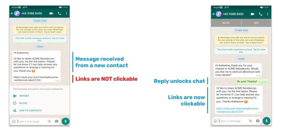
This limitation with links has actually become the norm for many messaging apps in order to protect users from potentially dangerous links and scams. While your links (hopefully) don’t fall into this category, these apps aren’t able to recognise that, so here’s what you can do to make your links clickable.
🔧 How to fix this:
Your links will be clickable once a prospect sends you a reply to “unlock” the chat. Even something as simple as a thumbs up 👍 from them will do the trick.
Therefore, in the first message you send them, just ask a simple yes/no question to get a response from them. Once they reply, you can send them your link and it will be clickable.
To make sure that they do respond to you, remember the 10-Second Rule of Messaging when writing that very first message.
2. They don’t have enough context to click your link confidently.
Most people don’t click links if they don’t have enough information about the sender or the link itself. That’s why it’s important to introduce yourself and briefly explain why you’re sharing the link with them.
But sometimes, they may still hesitate to click your link simply because it doesn’t look quite right. These could be weird-looking links that look like they were strung together by alphabet soup. They don’t give your prospect any context about what is inside the link. And they just look like all the other links people usually receive from scammers, fake casinos, and illegal moneylenders.
fileshare.net/jkjFnkSdefd
❌ Link doesn’t give any context
❌ Looks suspicious.
🔧 How to fix this:
You can make your link “prettier” by adding a “slug” to the end of it. This means adding a short description to your link that tells people what the link is about. You can add a slug by adding a hash symbol (#) at the end of your link, followed by a short description related to your business.
This is an easy fix that does not affect the functionality of your link. It will still lead to the same page and it will still be clickable. You may have noticed that most news sites and social networks already add these contextual “slugs” to their content links, which is why people are already used to reading the link URLs.
By adding the “slug” to your link, the noticeable difference now is this: when a prospect first sees your link, it’s not just gibberish to them – they’ll have an idea of what they’ll see after clicking.
For example, if you’re a realtor and you want to send a link to the brochure for ACME Residences, you can just add #ACME-Residences-Brochure at the end of your link. Similarly, if you run a hair salon and you’re sending a link to your price list, you can add #Anne-Salon-Pricing at the end. By adding the hashtag, the link looks more contextualized and more relevant to your product or service.
fileshare.net/jkjFnkSdefd#ACME-Residences-Brochure
✅ Link gives more context
✅ More relevant to your product/service
3. They feel overwhelmed by your message.
It’s tempting to give your prospect all the information about your products or services in a single message. You might even have multiple links in the same message – all of them neatly labelled so the prospect knows which link to open (e.g. Floor Plan Link, Pricing Link, Sign Up Link).
However, this will just overwhelm your prospect and paralyse them from interacting with you further. Receiving 10 links at a time can easily lead to information overload, forcing your lead to spend half an hour going through each and every item before they understand what they’re even supposed to do or ask next.
Guess what? Your leads probably don’t have 30 minutes to go through your links right now. After all, they probably have many other urgent priorities throughout their day. As a result, they won’t even read the full message or click on your links, and they won’t even reply.
🔧 How to fix this:
Keep your first message short and sweet – just enough to clarify why you’re texting them and just enough for the lead to acknowledge you. Next, when you do send your links, send them one at a time with a short but descriptive message about what it is about. Sending content in bite-sized pieces doesn’t just make it easier for the lead to view the content and reply, it also increases engagement and conversation. This is great for relationship-building and increasing your chances of making a sale!
